Trading Indicator Highlight: Moving Average Convergence Divergence (MACD)
The Moving Average Convergence Divergence (MACD) is a momentum indicator that displays the relationship between two moving averages, providing potential trading signals when these lines cross.
The MACD line itself is the difference between two exponential moving averages. These are rolling averages that give greater weight to more recent prices. The MACD line is superimposed over another ‘signal’ line consisting of a shorter-term EMA. When the MACD crosses up over the signal line, this is potentially bullish and can be taken as a buy signal; when it crosses down, it is a sell signal.
MACD vs RSI
Like MACD, the Relative Strength Index (RSI) also shows momentum in a market. However, they measure this momentum in a different way, and can therefore give different signals. RSI measures a change in price in the context of the recent price range (typically over 14 candles). MACD compares two EMAs. Both are useful and can be used together to confirm a trading strategy, or to suggest caution. For instance, MACD might show that momentum for the trend is decreasing, and RSI is showing overbought or oversold conditions, indicating that reversal is likely.
Calculating the MACD
The MACD line is calculated by subtracting the 26-period exponential moving average (EMA) from the 12-period EMA (that is, a longer-term EMA from a shorter-term one). The signal line is the nine-period EMA.
MACD = 12-period EMA – 26-period EMA
The two lines are displayed together on a price chart, typically in different colours. The direction the lines are moving, which line is higher, and the distance between them can be used to give trading signals. The distance between the lines is often shown as a histogram (vertical bars), with the colour of the bars showing the direction of the trend. When the MACD line is above the signal line, the bars are green; when it is below, they are red.
Using MACD in trading
MACD is used to gauge momentum in a market. When the lines cross, this indicates a change in the trend for the given timeframe. The strength of the momentum can also be assessed using the rate of change of the MACD line. If it changes direction sharply, this shows that trend is also changing significantly; if the lines converge but barely cross (the histogram will be fairly flat), this shows that the change in price trend is not strong.
The distance between the lines is also important, since when the lines are far apart this shows that momentum is high. Crossovers are considered a better signal when they cross in the direction of the overall longer-term trend. Lastly, MACD can be used to show divergence. For example, if the MACD shows a low and then a higher low, but the price shows two lower lows, this is bullish divergence: momentum for the downward trend in price is fading.
Shortcomings of MACD
MACD is a lagging indicator, and can signal a trend change without one actually occurring (or missing a reversal). This tends to happen more in a ranging market, where price oscillates around a certain level rather than moving clearly in one direction.
How to add the MACD to a Chart
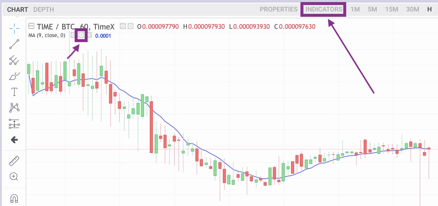
Open your desired market on TimeX.io exchange, i.e the TIME/BTC market, locate the price chart window, and click Indicators.

Then search for and choose MACD.
You should now see the MACD Indicator on the chart. Now you can edit its inputs and style by clicking on the gear-symbol next to the indicator list, shown beneath the TIME/BTC market symbol on the left of the chart.
